

Rail Unit Brand Identity
Rail Station
Rail Unit is a modern railway service provider specializing in highly qualified railway personnel for companies across Germany.
Founded by experienced railway professionals, the company combines industry expertise, fast decision-making, and a people-first mindset to deliver reliable and flexible solutions for the rail sector.
Direction,Drive & Destination
Rail Unit exists to support the railway industry with dependable, highly qualified professionals while creating long-term partnerships built on trust, speed, and operational excellence.
Rail Unit combines deep industry knowledge with a modern and flexible approach. Unlike traditional staffing providers, the company is built by railway professionals who understand the realities of the industry and can respond quickly with practical, people-focused solutions.
Rail Unit aims to become one of Germany’s leading railway service providers by setting a new standard for professionalism, communication, and reliability within the rail sector.
Passengers
Rail Unit primarily works with railway operators, logistics companies, and railway training organizations across Germany that require reliable and qualified railway personnel.
The brand also appeals to experienced railway professionals looking for a trustworthy employer with strong values, flexibility, and long-term career opportunities.
Personality & Values
Professional • Reliable • Modern • Confident • Human
Rail Unit communicates in a clear, direct, and approachable way while maintaining a strong sense of expertise and professionalism.
Competence • Integrity • Authenticity • Teamwork • Appreciation
These Values reflect Rail Unit’s commitment to quality, trust, and respectful collaboration across every level of the business.
The Logo
The Rail Unit logo is a combination mark featuring a custom designed wordmark paired with a train silhouette in motion. The motion effect is created through the extended lines flowing beyond the initial letters “R” and “U”, reinforcing the feeling of speed, movement, and connection.
The Primary Logo consists of the full wordmark and should be used in most applications. When space is limited, the Icon Logomark may be used as a secondary logo variation.
The Secondary Logo is simplified to the “R” letter and represents a moving train inspired monogram, with extended motion lines creating the feeling of speed, movement, and direction.


Color Palette
The Rail Unit color palette consists of five tones, including two primary colors and three secondary colors. The primary colors are Safety Orange #F96226 and Deep Charcoal #101016, while the secondary palette includes grey and white variations derived from the charcoal tone.
Deep Charcoal should be used as the dominant background color, while Safety Orange acts as an accent color to attract attention. The secondary colors help balance the overall brand palette.
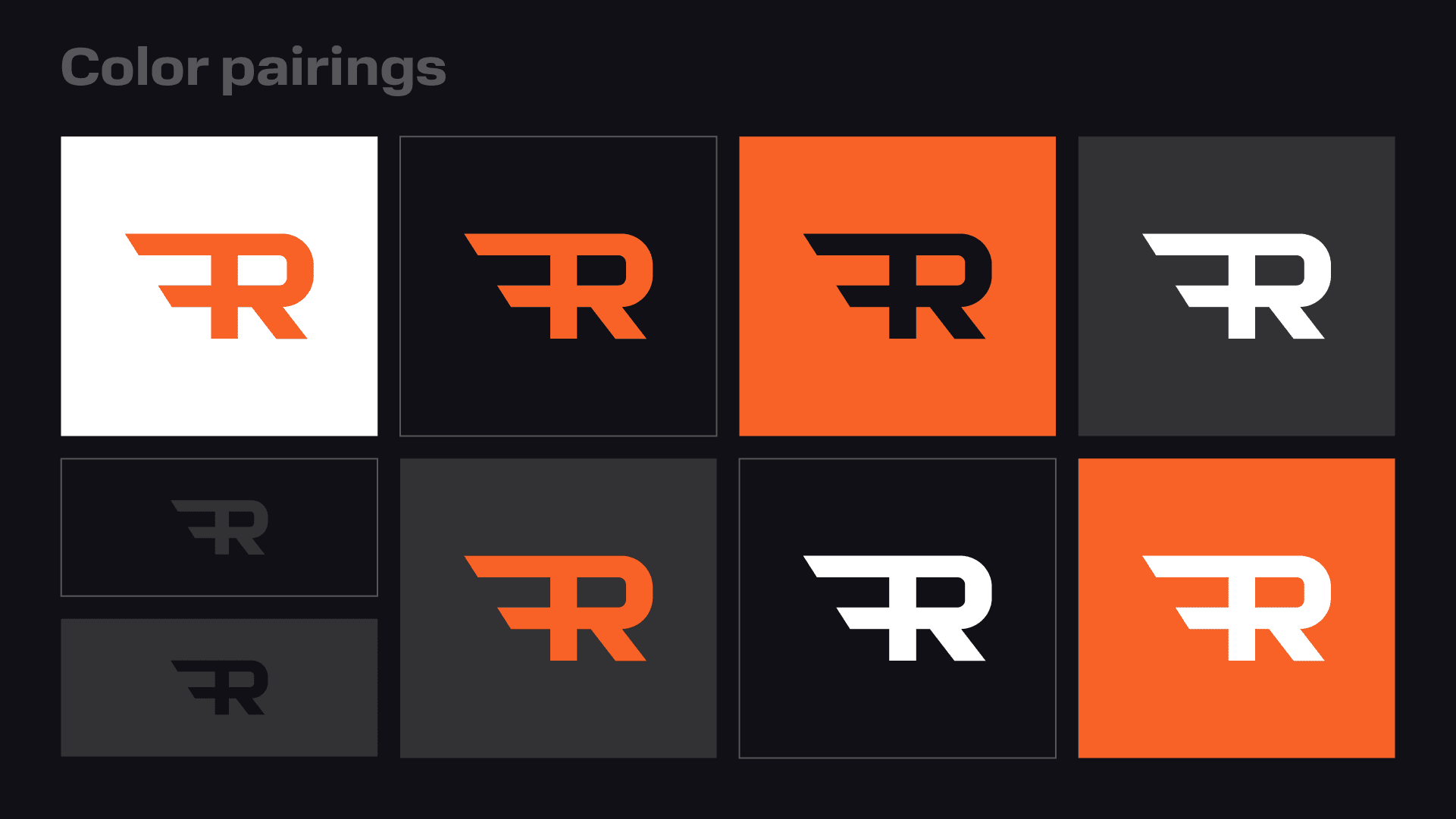
The brand colors should be paired as shown below to ensure strong contrast and maintain the visibility and readability of all text and graphic elements.
Typography
The primary typeface is Normalidad VF, a modern and strong variable font that offers a wide range of weights and widths. It should be used for headings and titles.
The secondary typeface is Wix Madefor Display, a clean and readable font available in multiple weights. It is best suited for paragraphs and body text.
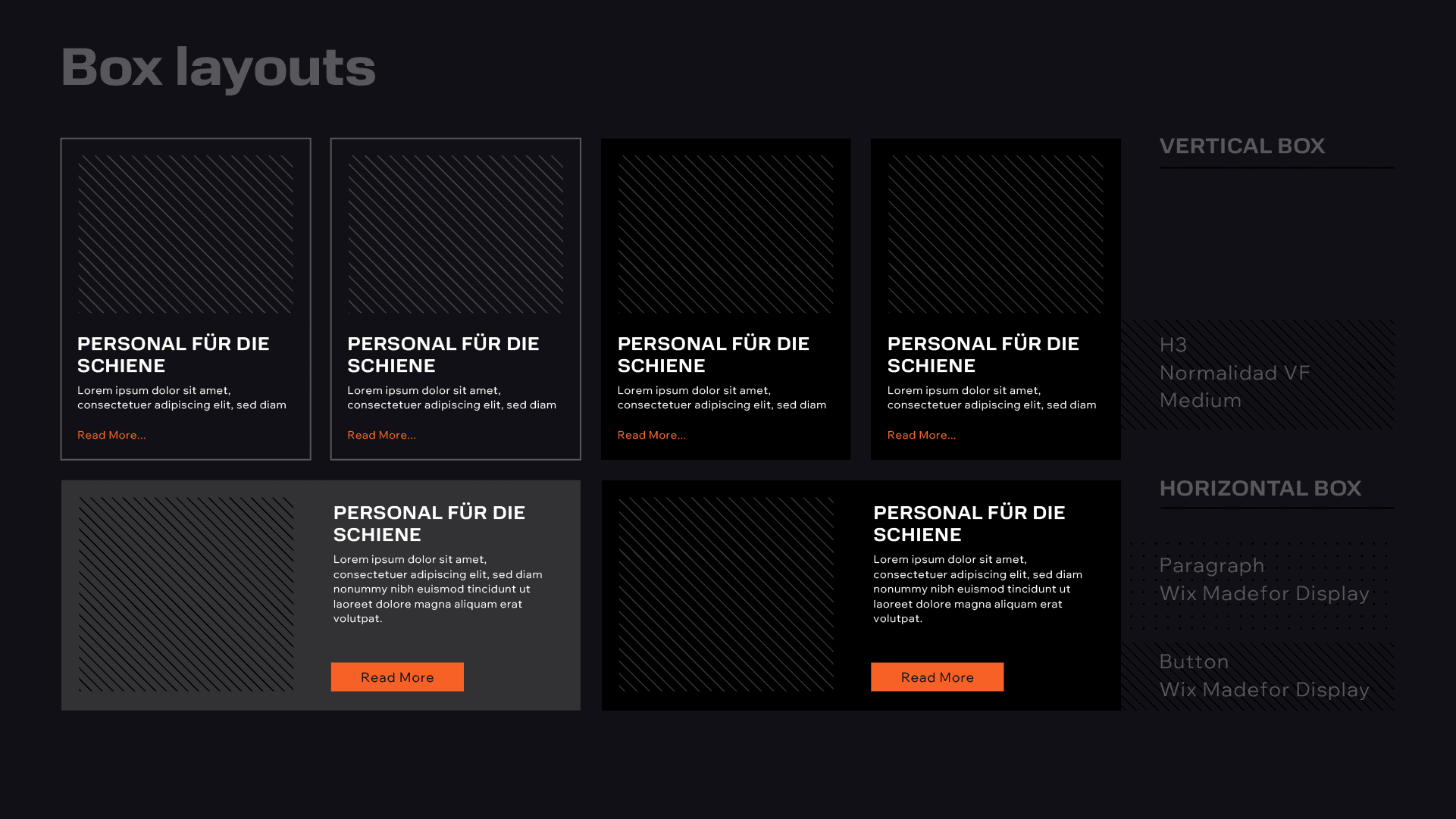
The Type Hierarchy is presented below, with the Normalidad VF font in Bold used for headings, the same font in Regular used for subheadings (H2), and Wix Madefor Display used for paragraphs, body copy, and buttons.




Brand Assets
The Rail Unit branding includes two patterns, one based on 45° lines and one using dots. These patterns are inspired by metallic textures and create a visual connection to the rail industry. Both patterns are available in dark and light versions, and work on dark, light and orange colored backgrounds.
The brand icons are line based, simple, and sharp edged to match the overall branding style. They can be used in a single color or paired with an orange accent color.


© 2026 by Kreatank | All Rights Reserved