
Sparkly Visual Identity
Smart Gifting Made Effortless
Sparkly is a smart gift-suggestion platform that helps people find thoughtful presents for every occasion. By combining event reminders, personalized recommendations, and curated gift ideas, Sparkly makes it easy to celebrate loved ones with meaningful gifts. Their mission is simple: to remove the stress from gift-giving and make thoughtfulness effortless.
The Brand Identity
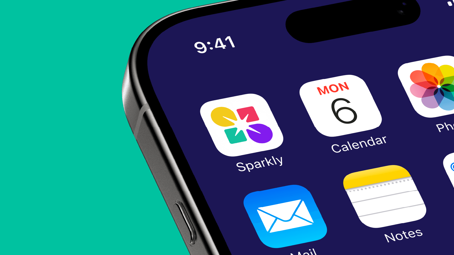
I developed the brand identity for Sparkly, designing a visual system that reflects its playful yet modern personality. The identity highlights the brand’s core values of ease, joy, and thoughtfulness, while positioning Sparkly as an approachable tech solution for everyday users. Built to be flexible across web, mobile, and promotional touchpoints, the system ensures a consistent and memorable experience. The visual assets include a custom logo, along with complementary graphic elements that enhance the playful tone and unify the brand’s style across all applications.
The logo
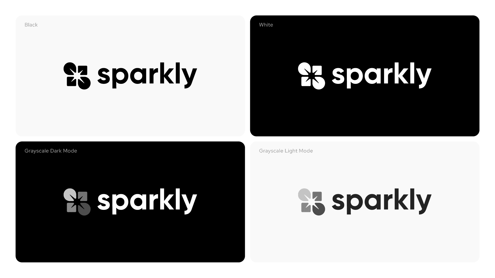
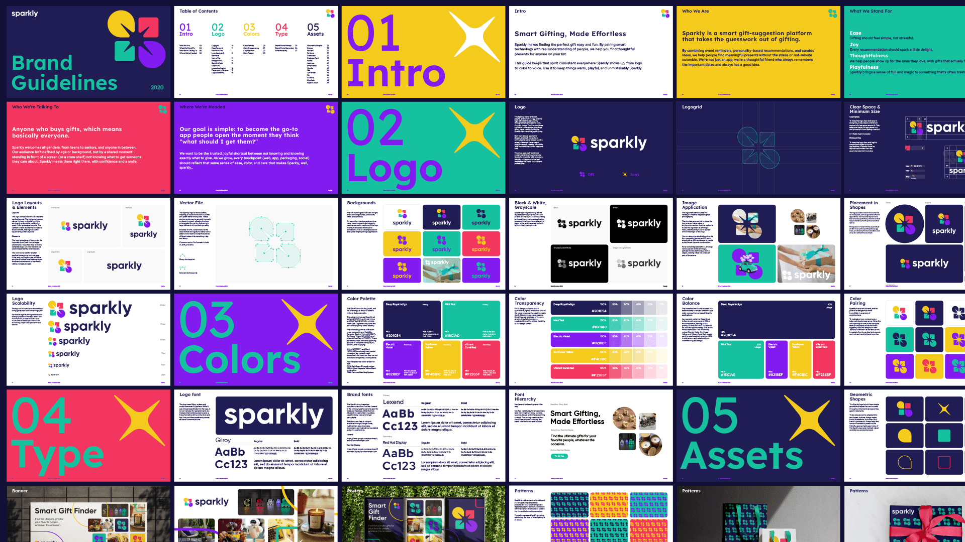
Since the name Sparkly already carries a strong meaning, I designed the logo by combining the symbols of a sparkle and a gift box. The mark uses a minimal, abstract style built from simple geometric shapes. A hidden sparkle/star is revealed through clever use of negative space, creating an engaging “aha” moment for the audience.






Colors
The Sparkly brand is fun, joyful, and full of energy, so its color palette reflects that personality.
The primary colors are Deep Royal Indigo (#201C54), a rich dark blue, and Mint Teal (#16C1A0), a bright, fresh cyan. Together, they form the core of the Sparkly brand identity.
The secondary palette adds even more personality and flexibility, featuring Electric Violet (#821BEF), Sunflower Yellow (#F4CB1C), and Vibrant Coral Red (#F2365F). These colors should be used as supporting accents to keep the brand playful, colorful, and engaging.
White (#FFFFFF) and Black (#000000) are considered neutral colors and are naturally used throughout the brand, so they are not included in the primary color palette.
Typography
The logo uses Gilroy, a clean and modern sans serif typeface. While it was chosen specifically for the logo, it is not intended for general brand use. Instead, the branding uses Lexend, a free alternative with a similar look and feel that provides consistency across all brand communications.
The Sparkly brand uses two complementary font families. Lexend is the primary typeface and is used for titles and headings, while Red Hat Display is the secondary typeface, used for body copy and longer paragraphs.
Both fonts are free to use and available through Google Fonts, making them easy to access, implement, and maintain across digital and print applications.


Brand Assets
The Sparkly logo is built from simple geometric shapes that can be used throughout the brand as supporting graphic elements.
These shapes can be adapted into text boxes, buttons, image masks, icons, illustrations, and other UI or branding elements. Always keep the corners rounded to preserve the friendly, approachable geometry of the Sparkly logo and maintain visual consistency across the brand.
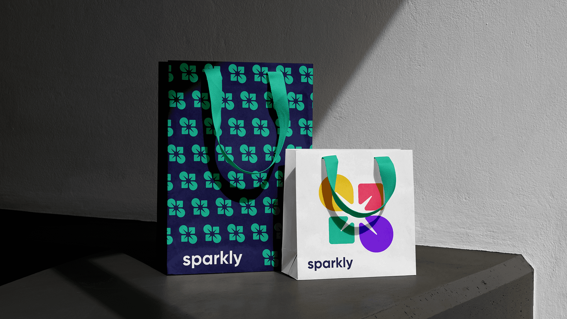
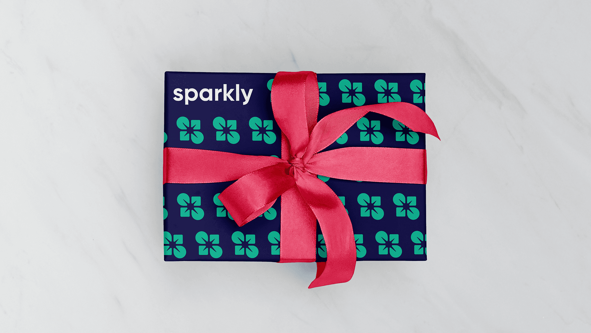
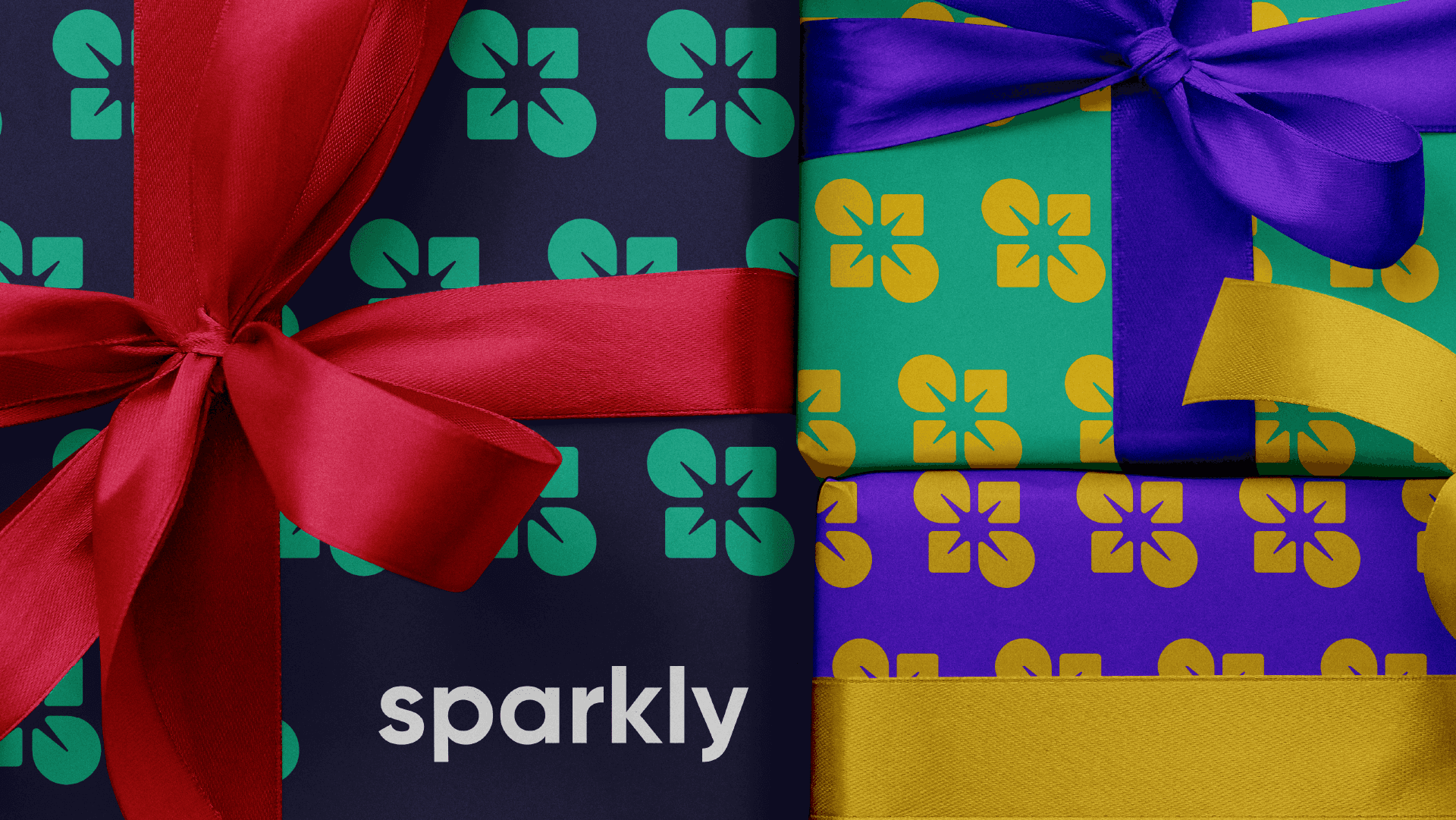
Sparkly is a vibrant and colorful brand, and the patterns reflect that personality. They use the logo as a repeated graphic element, combined with the brand's diverse color palette in a fun and balanced composition.
The patterns resemble gift wrapping, reinforcing the idea of what Sparkly is all about.







© 2026 by Kreatank | All Rights Reserved