

CRL Brand Identity
CRL works with businesses operating at the intersection of creativity and technology, offering legal support across intellectual property, digital, and entertainment.
With over 15 years of experience in the space, CRL understands how creative industries actually work. The approach is practical, modern, and built around clarity rather than complexity.
CRL is an established brand with a strong reputation. While other firms are entering the market, CRL remains the original, with deeper insight and a more relevant understanding of the industry. This is balanced with a more approachable and engaged way of working.
Project Scope
CRL started as Cam Rogers Legal, and I had the pleasure of designing the initial Visual Identity a few years ago. As the brand and company expanded, CRL approached me again for a rebrand, as the original name no longer suited the new direction, with a team of lawyers rather than just one person.
Besides simplifying the name, we also modernized the overall logo and branding system.
The Rebrand
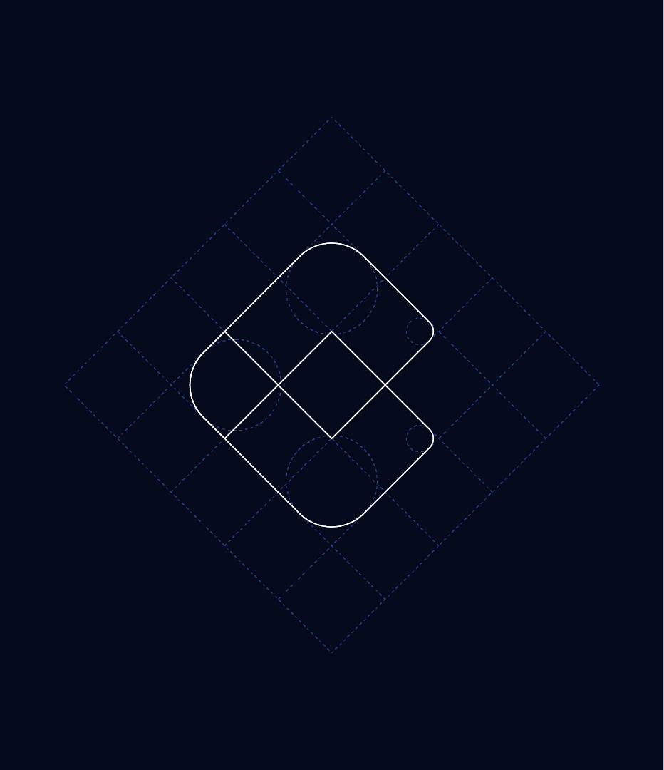
The logo is an abstract monogram that combines the initials C, R, and L into a single mark. A hidden pixel within the negative space references the digital industries CRL works with, while rotating the mark 90° reveals a set of scales, serving as a subtle nod to the legal field.
The identity is completed by the CRL wordmark, simplified from Cam Rogers Legal as a reference to the brand’s founder.
The logomark can also stand on its own as an abstract symbol representing the creative digital industry, the initials CRL, and a hidden reference to the scales of justice, symbolizing the legal field.
The visual style is modern, geometric, and flat. The logo is constructed from two overlapping shapes, creating a transparency effect that also conveys a sense of trust and connection.
The Cam Rogers Legal logo was first introduced in 2019. The shape and meaning behind the original logo remain largely the same, but in the current redesign, the mark was refined to feel friendlier and more modern by softening some of the sharp corners and updating the color palette.
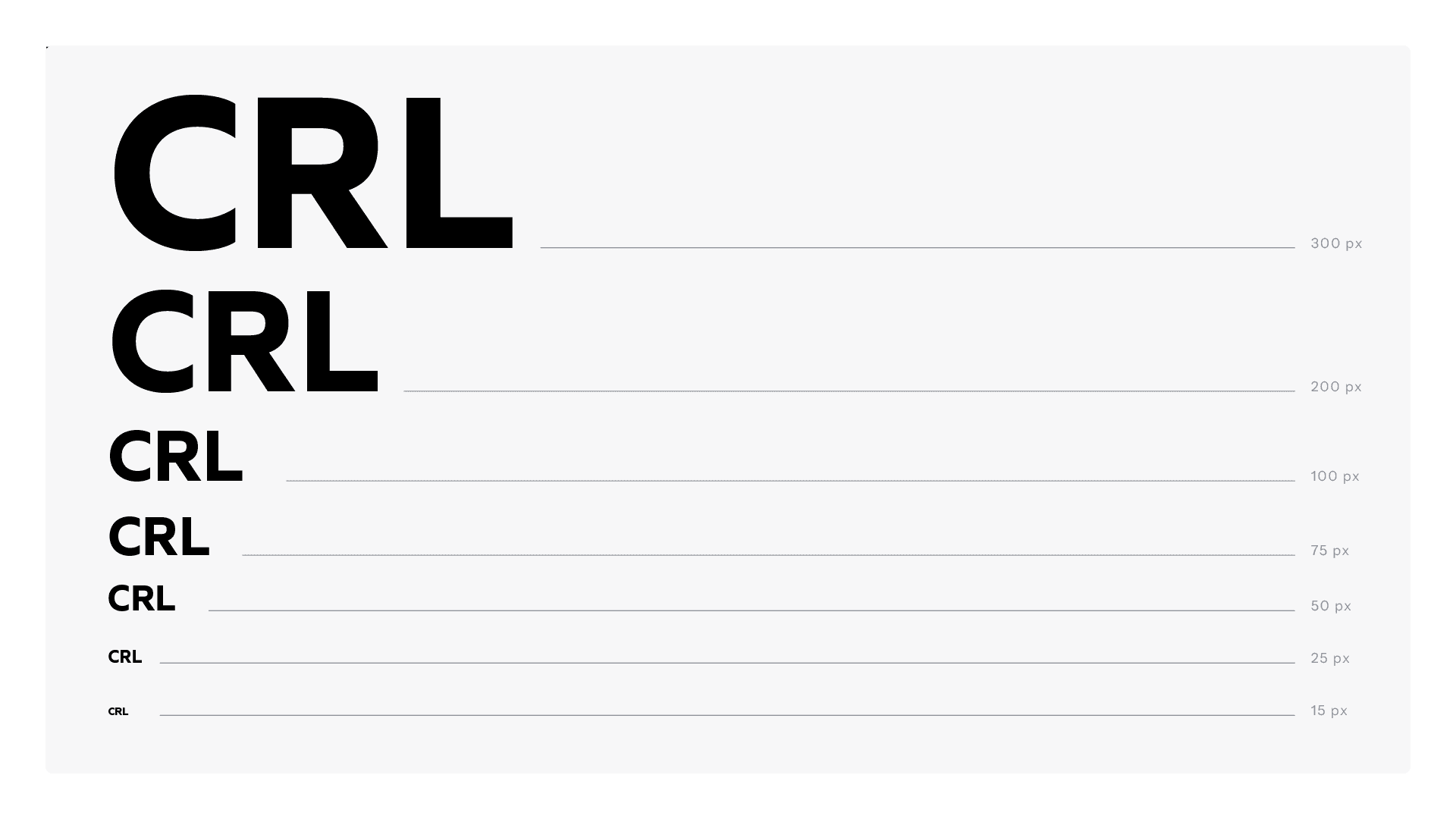
The wordmark underwent the biggest change. It was simplified from Cam Rogers Legal to the initials CRL, and the font was updated to a cleaner, more modern typeface.





Color Palette
The CRL brand color palette consists of two primary colors, Burgundy Crimson and Deep Space Navy, along with three secondary colors: Vibrant Raspberry, Bubblegum Pink, and Royal Indigo Blue.
Lighter tints of each color, shown beneath the color swatches, can also be used in more complex applications, such as UI design, as they belong to the same color family while providing additional flexibility and hierarchy.
The primary colors form the foundation of the CRL brand identity and should be used in most applications to strengthen brand recognition. The secondary colors complement the palette and are intended for UI elements, supporting graphics, and secondary marketing materials.
White (#FFFFFF) is not included in the palette, as it is considered a neutral base color and is naturally present across most brand applications.
Typography
The logotype uses Quiet Sans, a modern and clean sans serif typeface.
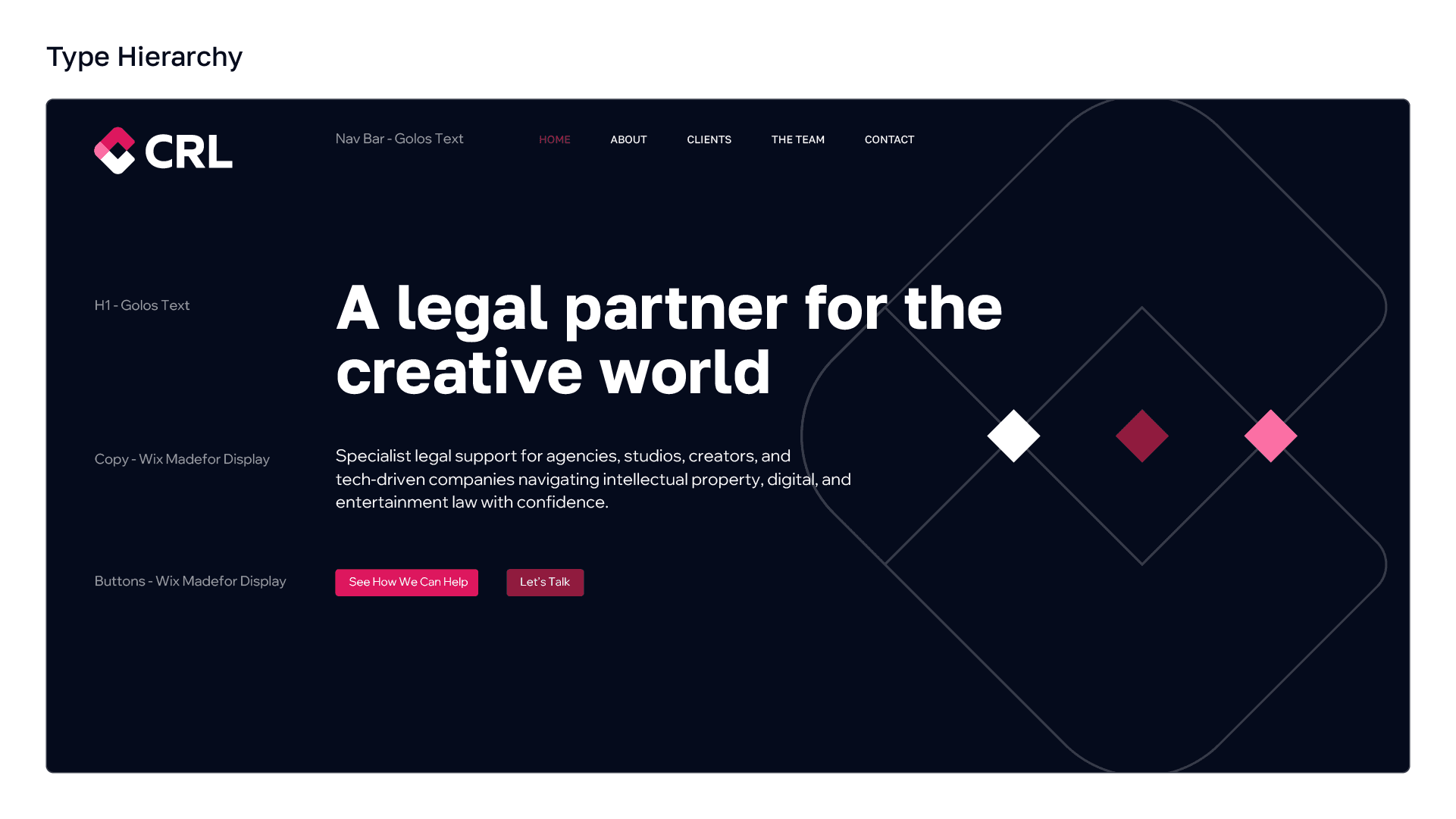
The CRL brand typography is built around two Google Fonts. Golos Text is the primary typeface, used for headings, titles, and other highlighted text, while Wix Madefor Display is used for body copy, paragraphs, buttons, and other supporting text intended for reading.



Brand Assets
The CRL brand identity is a well-built branding system centered around the logo design, typography, color palette, and complementary brand assets. These assets include stationery, email signature, social media design, iconography, brand patterns, and other brand applications.
The CRL stationery suite consists of four core items: business card, letterhead, folder, and envelope.
The email signature presents the essential contact information alongside the CRL logomark and wordmark, used separately to create a clean and balanced layout. The signature is designed to work seamlessly in both Light Mode and Dark Mode, ensuring clarity, legibility, and a consistent brand presence across email clients.
The social media profile and cover designs highlight the CRL brand in a clean and consistent way. The profile picture features the CRL logomark on a white background for maximum recognition at smaller sizes. The social media covers showcase the wordmark centered on the brand's red-to-black gradient, complemented by the one-color outline version of the logomark as a subtle brand graphic.



© 2026 by Kreatank | All Rights Reserved