
Client
Voltaic
Industry
Gaming
Project
Visual Identity
Year
2021
Voltaic Visual Identity
Voltaic is a multi-purpose community and educational team dedicated to mutual self-improvement in FPS games, aim training, and talent discovery.
The community promotes growth through a variety of initiatives, including challenges, tournaments, ranked teams, free resources, coaching, mentoring, and peer support. Voltaic is committed to fostering an environment where players can level up their skills while also building meaningful connections.
In addition to supporting player improvement, Voltaic actively promotes standout individuals, such as talented players, content creators, and educators, by collaborating with them to develop high-quality educational resources for the broader gaming community.
Voltaic is home to the largest FPS improvement Discord, with over 25,000 members. Their impact has been recognized by Discord, which has partnered with Voltaic and features the server in its Educational Communities Server Browser.
Brand Values
Welcoming, Safe, Creative, Motivating, Inspiring, Inclusive, Helpful, Competitive

Visual Identity
Voltaic is a versatile gaming community primarily focused on First Person Shooter (FPS) games, though its reach extends beyond that genre. The current initiative involves a full rebranding of Voltaic, aimed at reinforcing its identity as a community that feels like a game, where members can progress through ranks by completing missions and tasks.
The goal of this project was not just to redesign the old logo, but to build a cohesive and immersive brand identity that truly resonates with the gaming community, a community that feels both like a home and a game.
To achieve this, we focused on making every detail feel like part of a video game world, using a dark-themed, modern cyber style infused with energy, action, and a sense of progression. The result is a bold, dynamic visual identity that speaks directly to gamers.
One of the main challenges with the previous logo was its lack of clarity and distinctiveness. Without the accompanying brand name, the logo was difficult to recognize. Additionally, it struggled with legibility and scalability, often losing detail when displayed at smaller sizes.
Despite these limitations, the original concept behind the old logo held value. In the rebranding process, we chose to preserve the core idea while redesigning it for better adaptability, legibility, and consistency across all applications.
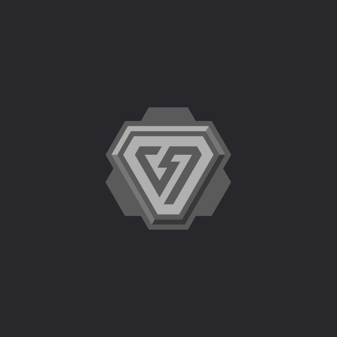
The Logo
While the old logo lacked legibility and clarity, the new logo is bold, energetic, and instantly recognizable.
We retained the core element from the original design, the lightning bolt, but refined it for clarity and impact. The logomark features a triangular shape formed by a single, continuous bold stroke that seamlessly connects the lightning bolt with the overall structure.
The apexes of the triangle have been intentionally cut to give it a cyber-inspired look, reflecting the FPS gaming aesthetic while also improving versatility, for example, making it work better within circular formats like profile pictures.
The sense of energy and intensity is further amplified through the vibrant cyan and dark grey brand color contrast, reinforcing the modern, high-voltage style of the Voltaic brand.


Colors
The primary brand colors are cyan and a dark grey that’s almost black. This color combination was chosen for its strong contrast; cyan represents energy and high voltage, while dark grey provides a grounded, neutral base.
Cyan is mainly used for the logo and key highlights, adding vibrancy and emphasis. Dark grey is primarily used for backgrounds and text, especially when placed on lighter backgrounds. Overall, the branding leans heavily on dark-themed backgrounds, as cyan appears most vibrant and energetic against darker tones.
Shades of purple serve as secondary colors and are used for color grading, interactive elements like buttons, and occasionally for backgrounds to add depth and variation.
Primary colors: Cyan ( #00E0FF ), Dark Grey ( #101016 )
Secondary colors: Purple ( #553DBD, AC92FC ), Grey ( #27272D )
Typography
The brand and web typography is a combination of Geom Graphic and Realist Wide. Geom Graphic is a modern geometric typeface with a gaming and sporty feel, perfect for grabbing attention in headlines and display elements. Realist Wide, on the other hand, is a clean and highly legible typeface used for body text, ensuring easy readability.
Together, these two fonts create a visually balanced and cohesive look that aligns with the modern gaming aesthetic familiar to the Voltaic audience.
Logofont: Unbounded
Webfonts: Geom Graphic ( Headings ), Realist Wide ( Paragraphs )


Rank Badges
What sets this visual identity apart is the inclusion of a full set of rank badges, both detailed and minimal versions, to represent the progression players can achieve by completing missions and tasks. The ranking system begins with Iron as the lowest tier and culminates in Celestial, the highest and most prestigious rank. The design style blends futuristic cyber aesthetics with a strong gaming vibe.
The complex badges are designed for use in larger formats, where space allows for intricate detail. The simplified versions are optimized for smaller applications, ensuring clarity and legibility at all sizes.


Graphical elements
The visual identity for Voltaic includes the logo design, brand colors, typography, marketing visuals, social media assets, merchandise applications, and stationery. Together, these elements create a consistent, modern, and playful branding experience that resonates with the gaming community. At Voltaic, the brand feels like both a home and a game, a space where players belong and level up.


